Verify.Dog
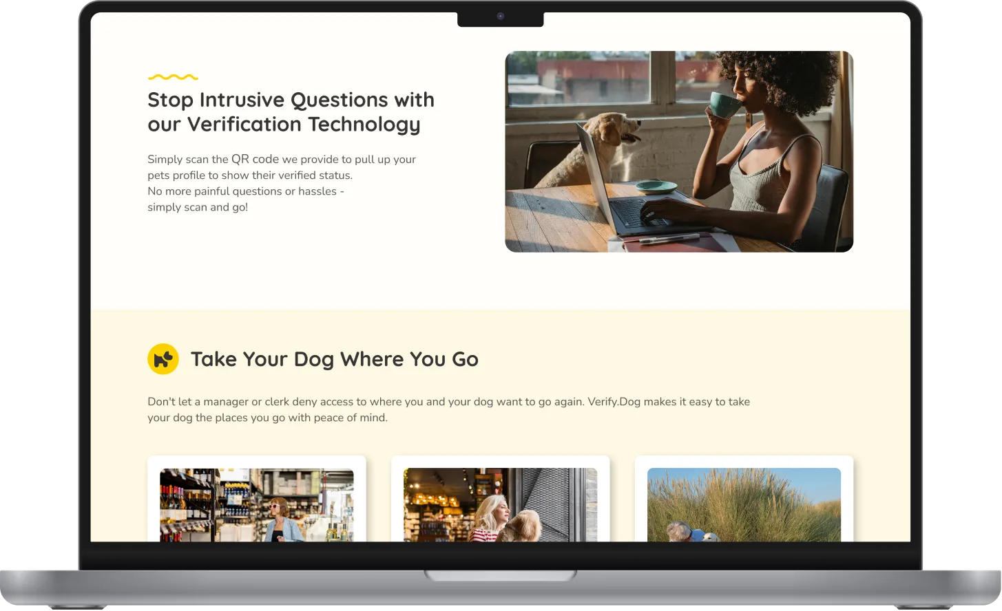
Objective: Design an intuitive interface for an animal verification service that minimizes user cognitive load and builds trust through visual metaphors and repeated entry points (CTAs).


Methodology & Approaches
Content Hierarchy:
Applied the “F-pattern” reading principle: prominent H1–H2 headings → concise descriptions → accentuated buttons.
Visual Encoding of Scenarios:
Illustrations and iconography (dogs in travel, shopping, flying contexts) to create multisensory links to real use cases.
Color Psychology:
Neutral backgrounds + vivid accents (yellow/orange) for guiding elements, evoking a “warm” emotional response and optimal readability.
Verification & Trust Signals:
Social proof (350 K+ verified profiles, partner logos) and an FAQ section to alleviate user doubts.
Implementation Stages
The implementation began with in-depth research, including competitive analysis and interviews with pet owners to understand their needs. Based on these insights, we developed modular wireframes for the key sections, ensuring a logical and user-friendly structure. A comprehensive UI Kit was created to unify typography, color schemes, and components across the project.
Then built a clickable prototype in Figma and conducted A/B testing to optimize CTA performance. Through iterative improvements, refined the headline messaging, adjusted contrast levels for accessibility, and introduced clear visual metaphors to enhance user understanding and engagement.

